Drop Down Now Included In Vertex
- Extensions
-
 Drop Down Menu Unlimited Level Options
 Menu Widget Example This is a sample widget to showcase the functionality of the S5 Flex Menu system. This menu system contains up to 40 module positions and you can publish any module to any of these positions under any menu item.
 Grouped Child Menu Group Children Together
-
- Features
 Theme Specific Features Options Specific to This Theme
 Vertex Theme Features Powerful Theme Settings
 S5 Vertex Framework Learn More About Vertex
- Continued Vertex Features More Great S5 Vertex Options
Search Our Site
Top Row 1
Top Row 2
Top Row 3
- Written by shapdemoswp
- Published: 04 Oct 2010
On this page you will see all the widget styles and sidebar positions available plus how to set up each of them.
All sidebars are fully collapsible
What exactly is a collapsing sidebar? It's quite simple, whenever a postion does not have any widgets published, that position does not appear on the frontend of the theme. Consider the example below:
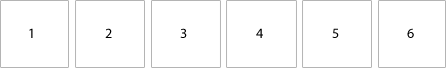
This particular row has 6 sidebar positions available to publish to. Let's say you only want to publish to 4 of these positions. The theme will automatically collapse the positions you do not want to use and adjust the size of the widgets accordingly:
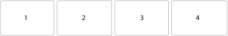
If no widgets are published to the row the entire row itself will not show. The best feature of this is every widget can be published to its own unique pages so the layout of your site can change on every page!
Infinite Layouts
Because there are so many sidebar positions available in so many different areas, the number of layouts you can create are limitless! For example, if you would like to show your main content area on the right side of your site but still have a column of widgets, simply publish your widgets to the Right or Right Inset position, or both. The same would be true for the opposite, if you want a column on the left simply publish widgets to Left or Left Inset. Of course you can always choose to not have a column at all. Remember, any position not published to will automatically collapse and the remaining area will automatically adjust. There is no need to choose a pre-defined layout for your entire site, simply use the power of collapsing sidebar positions and take advantage of the numerous amount of positions to create any layout you can dream of! Be sure to check out the layout of widgets below.
Dozens of Sidebars
Below is a complete list of all the sidebar positions available for this template.

How to configure widget styles:
- Install any plugin/widget you wish to publish to your site.
- In the widgets control panel, drag the widget to whichever sidebar(s) you want it to appear on (each widget has a built-in area where you can select which areas and/or pages to display the widget on).
- Select the widget style from the drop-down menu on the widget.

- Click "Save" (Note: If this is the first time placing the widget, you may have to click "Save" a second time before the style is applied).
- If you want to customize which widgets display on each page, return to the widget control panel and use the Widget Context options for each widget to set the placement properties.

Right
Dark
This is the Dark style and can be applied to most positions.
Gray
This is the Gray style and can be applied to most positions.
Highlight1
This is the Highlight1 style and can be applied to most positions.
Highlight2
This is the Highlight2 style and can be applied to most positions.
Highlight3
This is the Highlight3 style and can be applied to most positions.
Highlight1 Outline
This is the Highlight1 Outline style and can be applied to most positions.
Highlight2 Outline
This is the Highlight2 Outline style and can be applied to most positions.
Highlight3 Outline
This is the Highlight3 Outline style and can be applied to most positions.
Dynamic TitlesExtra!
Bottom Row 1
Bottom Row 2

")
Bottom Row 3
Debug
Room Booking
Thanks for staying with us! Please fill out the form below and our staff will be in contact with your shortly. The see all of our room options please visit the link below.
See All Rooms
See All Rooms