")
- Extensions
-
 Drop Down Menu Unlimited Level Options
 Menu Widget Example This is a sample widget to showcase the functionality of the S5 Flex Menu system. This menu system contains up to 40 module positions and you can publish any module to any of these positions under any menu item.
 Grouped Child Menu Group Children Together
-
- Features
 Theme Specific Features Options Specific to This Theme
 Sample Pages Predefined Pages
 Vertex Theme Features Powerful Theme Settings
 S5 Vertex Framework Learn More About Vertex
 Tutorials Get Help Here
- Continued Vertex Features More Great S5 Vertex Options
- Woocommerce
 Lorem ipsum dolor sit amet, consectetur adipiscing elit.
Sale: $39.99
Custom Widths
Published: 24 Sep 2011
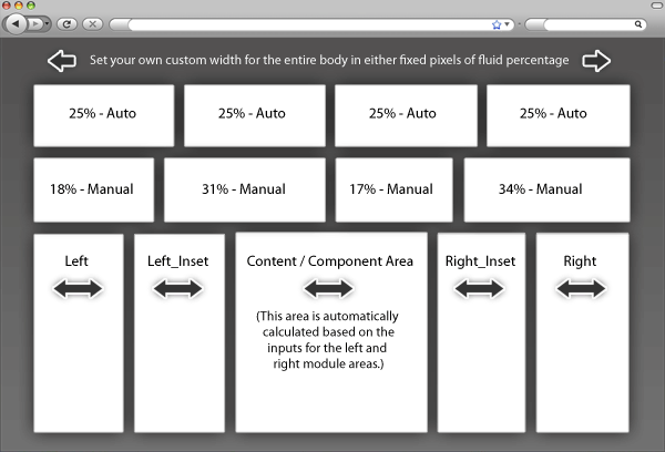
Fixed or Fluid Width
This theme has the ability to set the entire width of your set to either a fixed pixel width or a fluid percentage width. You can set the width to any size you want.Column Widths
You may also set the widths of the following positions to any width that you need to: left, left inset, right, and right inset. You may set them to any width you need to. Columns can either be set to a fixed px width or they can be set to a fluid percentage width. If you are enabling the responsive layout we recommend setting these to percentage width.Row Widths
This theme comes loaded with widget positions, many of which appear in rows of 6 widget positions. Any row that contains 6 widget positions can have it's row columns set to automatic widths or manual. For example, in the picture below the first row shows 4 widgets published and since it's set to automatic each is set to 25% width. The second row shows a manual calculation for each widget in the row. Again, you may do this for any row that contains 6 widgets. If you setup a manual calculation they must total to 100%. Not all 6 widgets need to be used, as shown below.All of this is done very easily in the theme configuration.