Every theme built on Vertex also comes with its own unique theme specific options applicable to that particular theme such as highlight colors, social icons, and much more. These features are in addition to the standard functions of Vertex, and are still controlled through the very user friendly interface of Vertex. This page will document the features specific to this theme.
Theme Specific Configuration Interface of Vertex
Below is a screenshot that shows all the theme specific features available in the user friendly Vertex admin: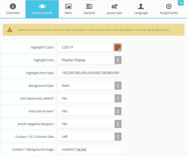
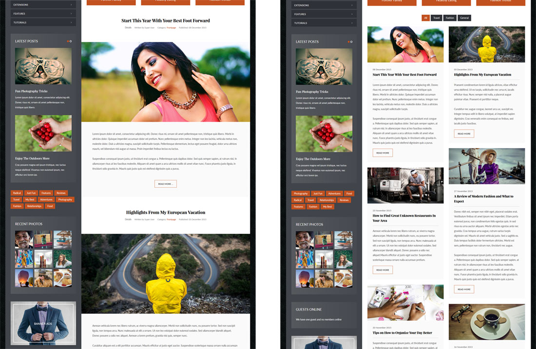
Content or S5 Masonry Layout
This feature is not a setting in the theme configuration, but it is a feature unique to this theme. Under the "Styles" menu of this demo you will see an option for "Post Layout", which uses the default blog structure, or you can use our S5 Masonry Widget published in the Top Row 3 area to display posts in multiple columns.Demo The S5 Masonry Method
Demo The Blog Structure
The image on the left shows the default blog structure, and the image on the right shows the S5 Masonry method.
Custom Highlight Color
Stylize your site with any color you want. Set your own custom color scheme with the built in highlight color. Control menu items, titles, buttons, hover over effects, backgrounds, and more. You can set this color to any color that you want. Below is an example so you can see how this works. In addition to these color options, Vertex itself is loaded with background color and images options under the Main / Layout page in the theme configuration.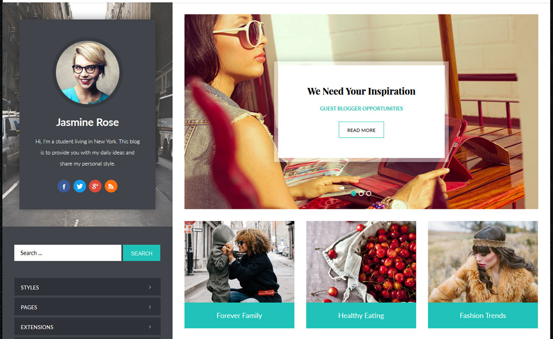
Custom Highlight Font
Choose a custom highlight font powered by Google fonts. This font is used mostly on titles, which you can see below in the S5 Image and Content Fader and post titles. This is used in conjunction with the default site font which is controlled under the Main / Styling tab in the Vertex theme configuration, and controls many other elements as well.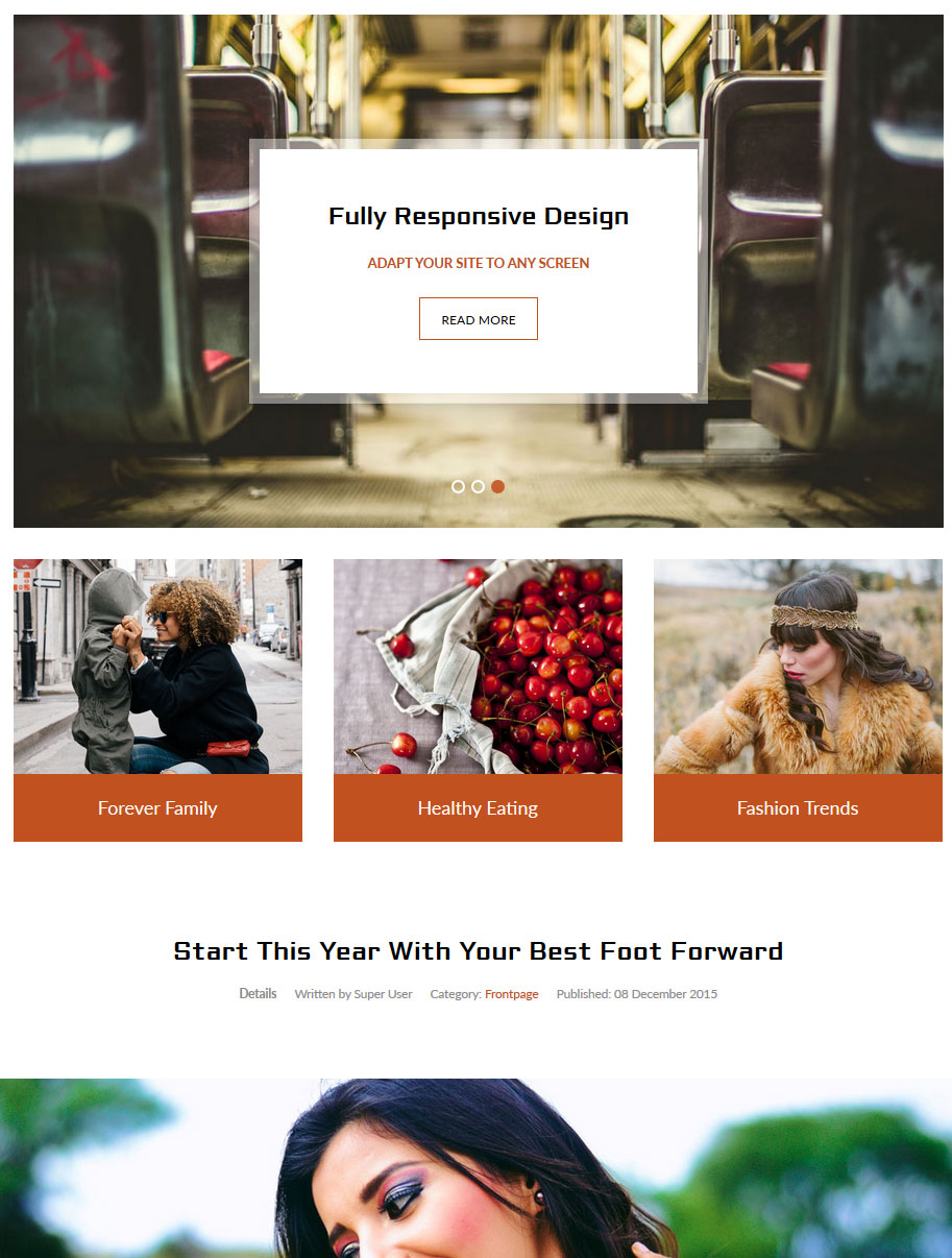
Light or Dark Background
Set the main background of the site to either a dark or light repeating background image. You can also override this feature entirely under the Main / Layout tab.Demo The Dark Background
Demo The Light Background
Uppercase Letters
Choose to enable or disable uppercase letters on menu items, buttons, titles and more.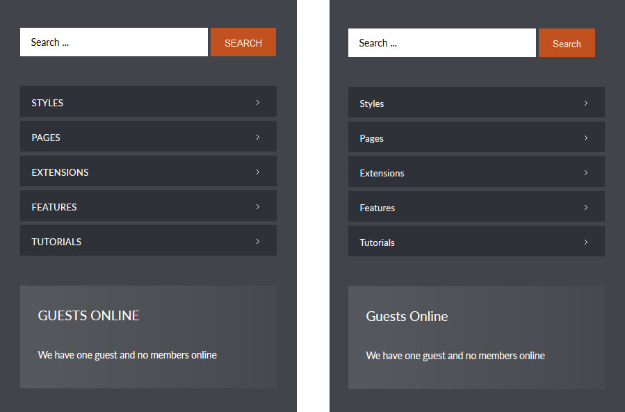
Hide Menu Arrows
With this option you can disable the menu item sub menu arrows on first level parent items.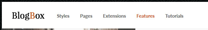
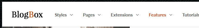
Custom 1 and Custom 2 Settings
This design has a unique column that extends most of the way down the site and next to the core row positions. On top is the Custom 1 position, which has unique paddings and a background image that you can set to your own image with the "Custom 1 Background Image" setting. In addition to this you can also pick which side you would like the column to show on.Demo The Column On The Left Side
Demo The Column On The Right Side


