- Details
- Written by Super User
- Category: Demo Info
- Hits: 7001
Features at a glance
- Responsive layout compatible
- Choose between 4 slide transitions: Fade, Continuous Horiztonal, Fade Slide Left, Continuous Vertical
- Specify height and width of module
- Includes a gallery tab drop down to show all images
- Each image slide can have its own hyperlink
- Show up to 10 images at once
- Publish your own content to each picture slide
- Navigation arrows
- Not all slides require titles
- Change delay time
- Hide or show: Navigation arrows, thumbnail carousel and popup text
I like what I see! I want to JOIN TODAY.
- Details
- Written by Super User
- Category: Demo Info
- Hits: 5090
This menu system works off of the core Joomla jquery/mootools scripts so no extra javascript library is needed and keep download sizes to a minimum. Also, if you do not want to use this menu you can simply turn it it off from the template configuration page.
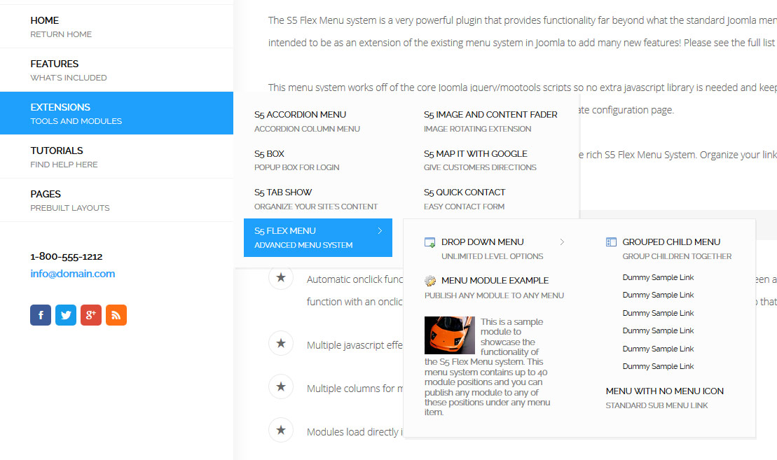
Take your website to the next design level by using the robust and feature rich S5 Flex Menu System. Organize your links with ease and show content in places you never could before!
Menu Features:
- Automatic onclick functionality for tablet sized touch screens. If a device's screen is detected as touch screen and is of table size, then the menu will function with an onclick method rather than the onmouseover effect that is shown on a laptop or desktop that has a mouse for use.
- Multiple javascript effects such as fade, slide, etc.
- Multiple columns for menu items or modules.
- Modules load directly into the menu.
- Group sub menu items into the same column or fly out.
- Optional sub texts for each menu item.
- Optional menu icon images for each menu item.
- Automatic multi-language menu change. If you are setting up a multi-language site, the flex menu will automatically change if your site's visitor has a language specific menu setup for their language in the menu manager.
- And much more!
Menu Screenshot:

I like what I see! I want to JOIN TODAY.
- Details
- Written by Super User
- Category: Demo Info
- Hits: 3990
Note - If the responsive layout is enabled the drop down will disable when the screen size reaches 750px so that it does not interfere with the mobile menu bar

- Customize almost everything! Shadows, borders, gradient, opacity
- Contains 6 module positions drop_down_1, drop_down_2, drop_down_3, drop_down_4, drop_down_5 and drop_down_6
- Auto adjust to the height of your content
- Set your own open and close text
- Auto collapse if no modules are published to it
- And many more features!
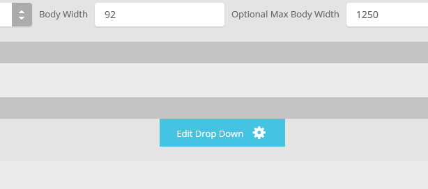
Screenshot of Drop Down admin in template configuration area:


